Anyway, with the day off, my friend and coworker Hartley mentioned that she was working on this redesign of a Colorado Springs baby and maternity clothier. The site the store owner has now was designed for free and they were having issues getting content added to it.
Before we look at where we went with it, let's look at some of the issues existing on the current site.
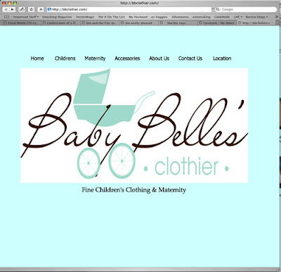
Here is the original front page. The designer distorted the aspect ratio of the logo and didn't resize the logo for a dial-up connection. It's not a horrible design but it's definitely very web 1.0.
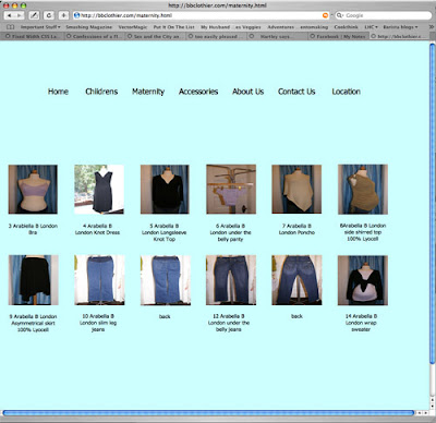
There are several issues with the product subsection of the original store. To begin with, there's no great delineation between product lines. If they'd been able to add the rest of the product that they wanted to add, their wouldn't be a really great way to easily sort through products. Additionally, the original images have been distorted to the square size instead of being resized and cropped. This warps the look of the clothing and makes them to appear wider than they should be, (not an especially great thing for a website aiming at selling high-end maternity clothing to expecting mothers). On top of that, the images being loaded on the page are the high resolution images and not thumb nails... all in all, a real bandwidth hog of a page.
When you click the images they're set to load the larger image in a new window. Here's what happens when you click a picture of one of the pairs of jeans...
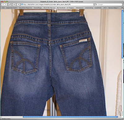
I'm not sure if you can see the resolution of the photo (it's 1280x1920), but that's much larger of a picture than it probably needs to be. In addition to the photos largeness, the page doesn't tell me anything else about the pants... how to order them, sizes they're available in, colors they're available in, PRICE... There's a lot of information that would be really useful.
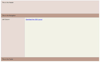
So there's our starting point. Hartley was still quite happy with the logo she designed (as is the client, which is the most important part) so we started thinking about what kind of a skeleton we wanted to build the body of the site on. Doing some research at Design Float, a design writing aggregator site I read fairly often, I stumbled on a site that has free CSS layouts available to design on top of. Looking through the templates, I stumbled on this layout and showed it to Hartley.
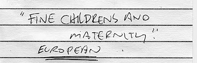
With the design chosen, we took a screen capture of the layout and brought it into Photoshop to start to put a skin on it. Before we did any work, we started to talk about what Hartley hoped to convey with the new look. I asked about the motto of the store and she mentioned "Fine Childrens and Maternity" and "European" (you can see the words I wrote down on my little notepad, below)
We started by grabbing the logo and dropping it on top of a newly created white background in the header section. When we dragged the EPS into our photoshop composition the image was much too large but instead of scaling it down, we converted it into a smart object and THEN scaled it down. The benefit of this is that it's almost like nesting the object inside of another composition. When you scale it down, you're scaling it down non-destructively, if you need to go and scale it up later (a no no if you're working destructively) you can scale it up and have it grab additional information from the composition it's nested in. It's a really great way to work and it's really starting to change the way I use Photoshop CS3.
We tried adding some textures behind the logo to make it stand out, looking at various paisley patterns from shutterstock, and really didn't feel like it was gelling.
Hartley had also mentioned in our initial discussions that she really liked the tone on tone look.

Wanting to try it, we tried creating a gradient from brown to white and laying it in the background, then changing the background header color to the dark chocolate brown in the text of the logo.
We really liked the way that the brown looked but it wasn't popping enough. There's kind of a trend in web design right now to do the 'web 2.0' thing. Glossy buttons, lots of polish. Another one of the sites I read, PSDTuts, posted a link to an article that gave us some inspiration. On my little notepad I drew Hartley some herringbone lines and we decided to try to layer some of those in along with highlites and lowlites on the brown.

When drawing little herringbone lines, I'd suggest always doing it in a vector program like Illustrator. The biggest benefit is that since it's a vector program, you can select your items, copy them and rapidly paste them until you have enough to grab a couple of them, pull them out to where you want them to end, then select the whole batch and do an 'align and distribute' that creates your herringbone pattern. It's a really great, quick solution.
The other nice thing about doing the lines in Illustrator was that, inevitably, when I screwed up, I could go back, delete a few lines from the middle, select the whole batch and distribute them again, making the space between the lines a little bigger. I also deleted all but one of my lines at one point, shrank the rotation on it to 20 degrees from 45 and finally pasted that into Photoshop. After some more futzing we had something that looked a little like this...

With that done, we started to try and figure out what our subnavigation and navigation was going to be. Our original thought had been that we'd use the left hand column to navigate through things... i.e. click the 'maternity' link and you'd go to a page that would let you select 'tops' or 'bottoms'. That works but it's kind of clumsy. We decided that we'd much rather go with dropdown menus. Without going through the whole process, we added some dropdowns that are built into Dreamweaver (which style themselves via CSS... that's cool mostly because it let me use background images for my rollovers instead of just color. )
This is what our pulldown menus looked like after quite a bit of futzing.

You can see that the blue from the logo has made another appearance, as has the brown (which appears as a 'hover' state when the mouse is over the button)
Anyway... with the main navigation done we had to decide what we were going to do with subnavigation. I love prototyping in Photoshop but I can't encourage sketching enough. You don't have to be the most amazing sketch artist in the world (I'm certainly not), but even just rudimentary sketches have helped me work through lots of design issues. Here's the sheet of notepaper we worked the subnav out on

I know it doesn't look like a lot, but that little piece of paper saved us a lot of time. The first thing we looked at was a straight thumbnail layout like what's on the current website.

I thought this is a clean layout but Hartley didn't feel that it conveyed enough information. From that thought, I came up with a second 'just text' idea.

This was also the initial thought for what eventually became the product closeup page. There are a couple of pros to this design. Going just text on the left hand navigation column allows you to convey a bunch of information about different products in a limited amount of space and it allows you to compress that information into a limited number of navigation pages (i.e. the little 1 and 2 buttons down on the bottom right hand corner of the left navigation box). Hartley didn't like that it didn't have ANY visual information though so we looked at a third option.
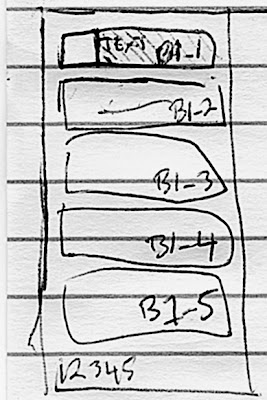
Here's our third design. You can see that while we can't put quite as many lines of information (we eventually found out we could have eight items per page) doing it this way meant that we could get a little bit of a balance between the purely visual and the purely textual. The numbering on the boxes was our initial thought for how we'd name the subpages of products with HTML names. We eventually just started naming them by number so instead of there being a boys1_1.html we decided to just go boys1.html, boys2.html ad infinitum.
After determining that that was the way to do the design we had to figure out how to implement it. My first thought was to do it in CSS.

The 1, 2 and 3 numberings on the diagram of one of the left hand subnav buttons indicate that I was thinking of creating three CSS divs for each navigation button. Div1 would have been the button container (what the other two divs sit in for organization purposes: think of it like a box) and then there'd be a separate div for the thumbnail and text. That works and I think it would have worked, but in the interest of time, and since Hartley was going to have to implement this on her own for the most part after our design time, we decided to go a quicker and dirtier route.
I know they're old school but I'm a big fan of imagemaps. I've been using them lately when I put together HTML e-mails, mostly because the code decays much more gracefully. I've had more luck with an e-mail program recognizing my imagemap than I have with some other rollovers and stuff. So, I thought, why not try it with these navigation buttons. It actually worked pretty well. So, the way everything is set up, instead of creating a whole series of thumbnails, we just create one graphic for each set of subnavigation. When someone navigates to page 2 of a category of products they get a completely new image but when they're looking at the first eight products the links are just from one imagemap. That sounds kind of confusing but, trust me, it works.
Here's what our complete navigation looked like

you can see that we sampled a little bit of the header brown and herringbone for the background behind the text. Size wise, these little navigation images were coming in around 15-18k. Which, for the most part, is sipping bandwidth.
Here's our completed product navigation page

Hartley has spent a good chunk of tonight working on all of the product imagery and navigation images. Hopefully the site will be up by the end of the week. (pending client approval of course)
Off to bed. I've got the weekly Tuesday morning class I have to tape tomorrow. 4:30 is going to come too soon.
More tomorrow.


